Tables are a really common way of displaying data, but have you tried looking at a table on your phone? It sucks.
The problem is tables aren’t really designed for mobile, so we need to change them to something that is much more conducive to a smaller screen.
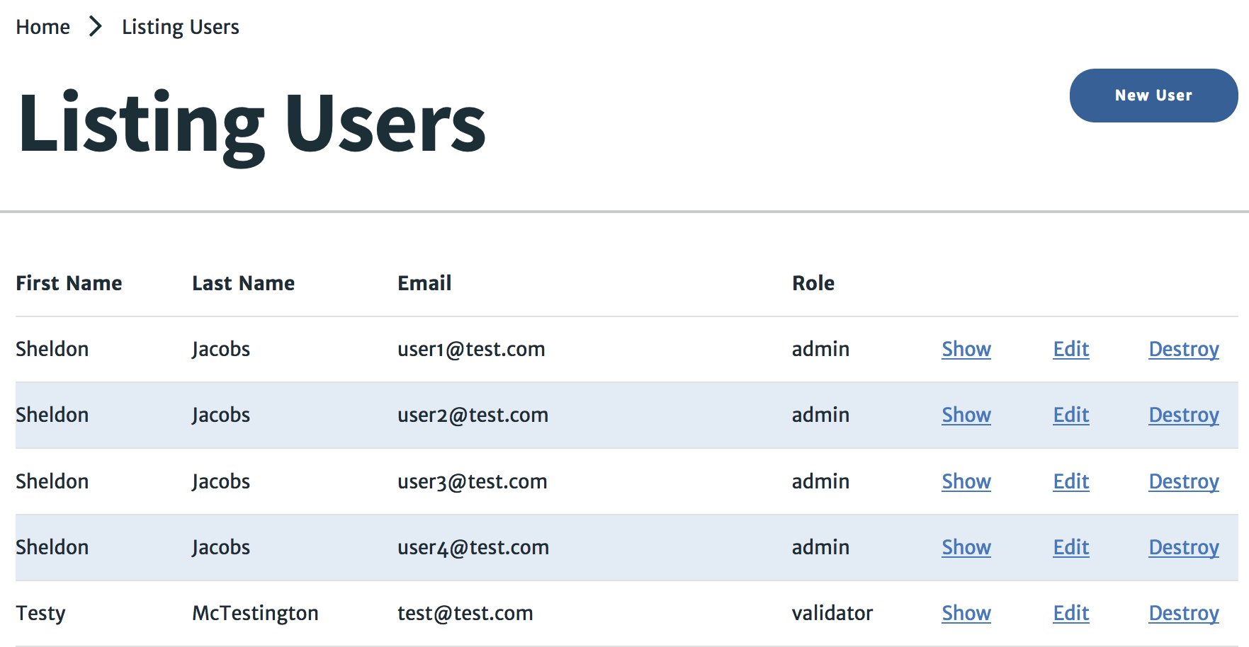
There’s a great tutorial from CSS-Tricks about this, and we used it to take our tables from this…

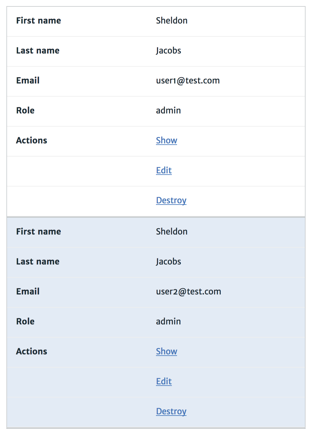
to this…

This relys on displaying each of the cells as a block and pushing everything else down. To get the labels, you have to manually set them in the CSS. This is a bit of a pain but I found a nice solution using Sass.
We’re going to use Sass to create a mixin that we’ll call responsive-table so that we can reuse this for every table we want to make. Now the magic here is that we’re taking in a list of arguements into our mixin, and we’re looping through the list and creating a new label to each table cell as we go. This creates our labels on the mobile view, and we can then just use our mixin like this
  .table--users {
    include responsive-table("First name", "Last name", "Email", "Role", "Actions")
  }
Here’s the full code…
@mixin responsive-table($labels...) {
  tr:nth-child(even) {
    background-color: $table-row__bg-color;
  }

  @media screen and (max-width: $break__tablet) {
    table, thead, tbody, th, td, tr {
      display: block;
    }

    thead tr {
      position: absolute;
      top: -9999px;
      left: -9999px;
    }

    tr { border: 1px solid $table-row__border-color; }
    th:first-child, td:first-child { padding: none; }

    td {
      /* Behave  like a "row" */
      border: none;
      border-bottom: 1px solid #eee;
      position: relative;
      padding-left: 50%;
      min-height: 24px;
    }

    td:before {
      position: absolute;
      top: 12px;
      left: 15px;
      width: 45%;
      padding-right: 10px;
      padding-bottom: 12px;
      white-space: nowrap;
      font-weight: 600;
    }

    // Loop through arguements and create a new label for each
    @for $i from 1 through length($labels) {
      td:nth-of-type(#{$i}):before { content: nth($labels, $i); }
    }
  }

  @include e(head) {
    border-bottom: solid 3px $table-head__bottom-border;
  }

  @include e(header) {
    &.is-asc {
      &:after { content: "˅"; }
    }

    &.is-desc {
      &:after { content: "˄"; }
    }
  }
}
Then we use our mixins for each table!
@include b(table) {
  @include m(reports) {
    @include responsive-table("ID", "User name", "Agency", "Timestamp", "Date of discovery", "Status of ape(s)", "Confiscated?", "Status", "Actions")
  }

  @include m(users) {
    @include responsive-table("First name", "Last name", "Email", "Role", "Actions")
  }

  @include m(agencies) {
    @include responsive-table("Name", "Email", "Website URL", "Actions")
  }
}
